A package page should reduce comparison work
When clients see several package options, they try to understand what changes: number of sessions, rhythm, support, price, and expected outcome.
If those differences are buried in paragraphs, the client may hesitate or ask for clarification before booking.
Compare packages on the same criteria
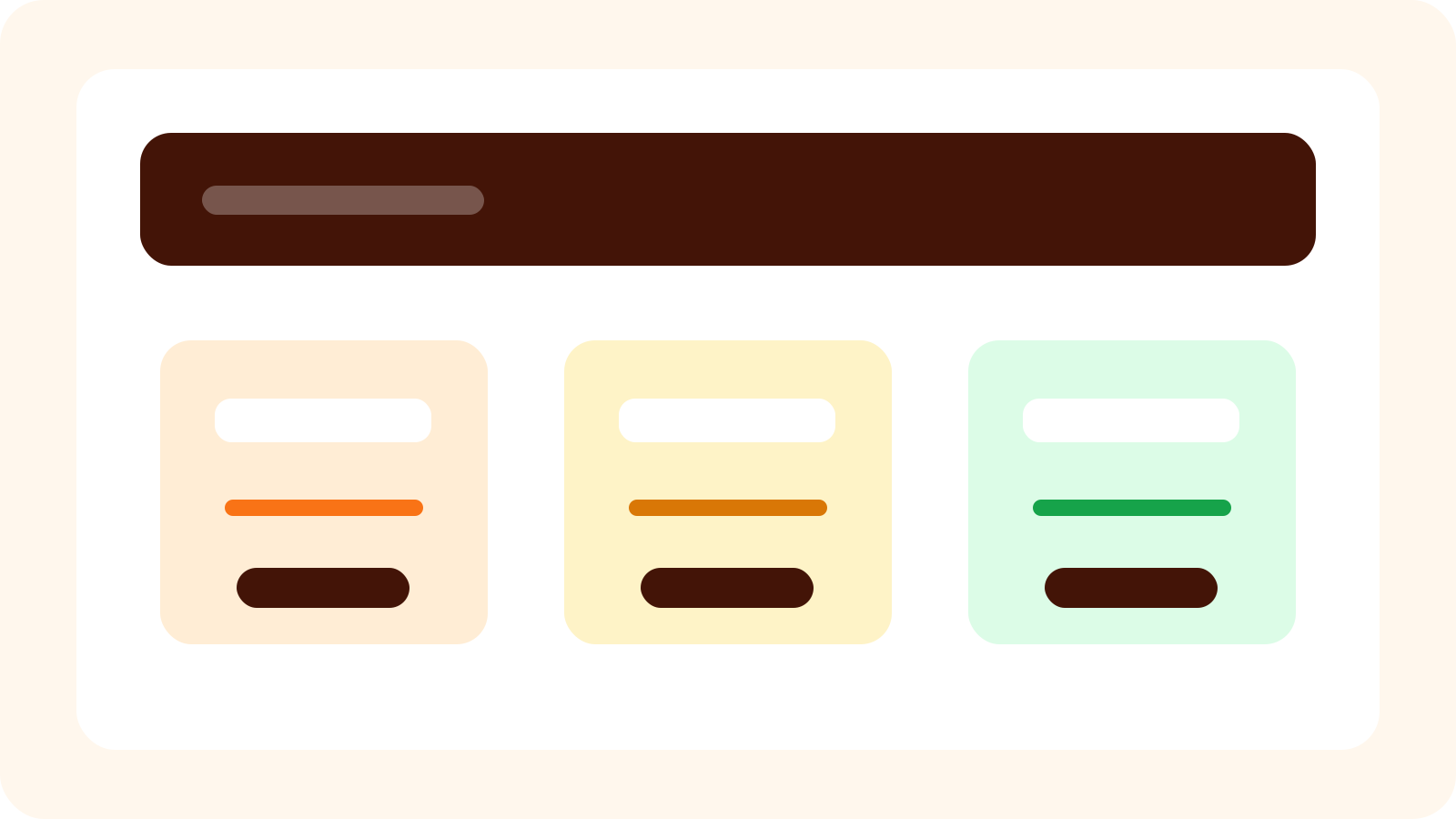
The easiest package pages use the same structure for each offer. This makes comparison faster and lowers the risk that clients choose the wrong fit.
The goal is not to oversimplify the service, but to make the decision readable.
- Who the package is for.
- What goal or situation it supports.
- How many sessions are included.
- Recommended rhythm between sessions.
- What happens after the package ends.
Avoid naming packages only by size
Names like small, medium, and large are easy internally but not always useful for clients. A name connected to the client goal often works better.
For example, a puppy start package, a recall focus package, or a home routine package tells the client why the option exists.
Keep a path for unsure clients
Some clients will not know which package fits. Give them a simple fallback: book an assessment, request guidance, or choose a first session before committing.
That keeps uncertainty from blocking the booking entirely.